Redesigning GitHub Education's site navigation for the user's learning journey
GitHub Education • 2023 • Lead Product Designer
My redesigned site navigation for the GitHub Education web platform driven by the student learning journey.
After years of existing as a single dashboard, the GitHub Education web platform was due for a redesign.
The GitHub Education web platform started as a dashboard for students to quickly access free offers and programs provided by GitHub.
However, over time, as the team added more web-based features, the dashboard became more and more bloated, to the point where it overwhelmed new and returning users alike.
Looking at the wide range of features, programs, and benefits this redesign involved, I realized we would need to reimagine how the GitHub Education platform itself should be reorganized.
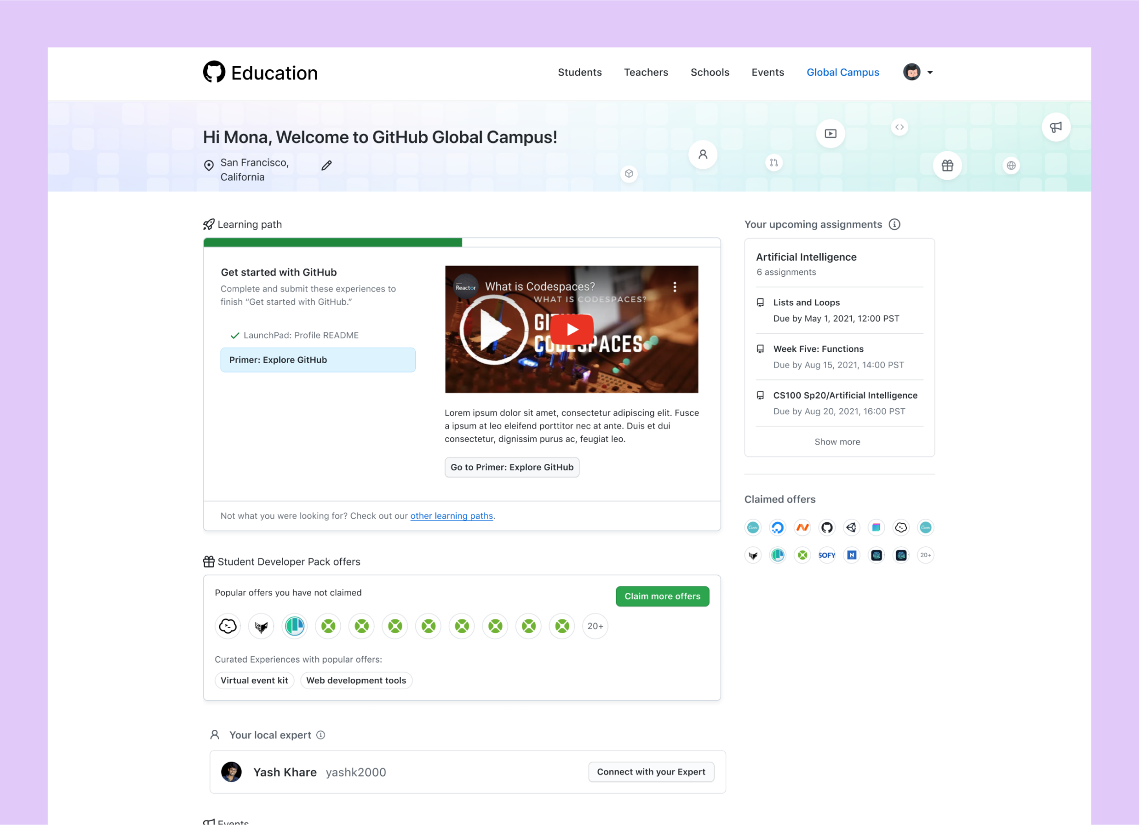
The previous GitHub Education web platform with all features and programs in a single dashboard view.
I collaborated with stakeholders to organize our features around "pillars" in the student's learning journey.
I facilitated a round of brainstorming workshops with stakeholders to understand how GitHub Education's features might be organized around the student learning journey. We arrived at three "pillars" that effectively categorized the different goals students have throughout their learning journey:
-
🎓
Learn new skills
Learners benefit from solo learning with official curriculum from GitHub.
-
⚡️
Find opportunities
Learners benefit from "real-world" learning by exercising their learned skills.
-
💬
Get connected
Learners benefit from advice and inspiration from other learners.
And thanks to the brainstorming activity, I already knew how all our existing features and programs fit in perfectly into these three pillars.
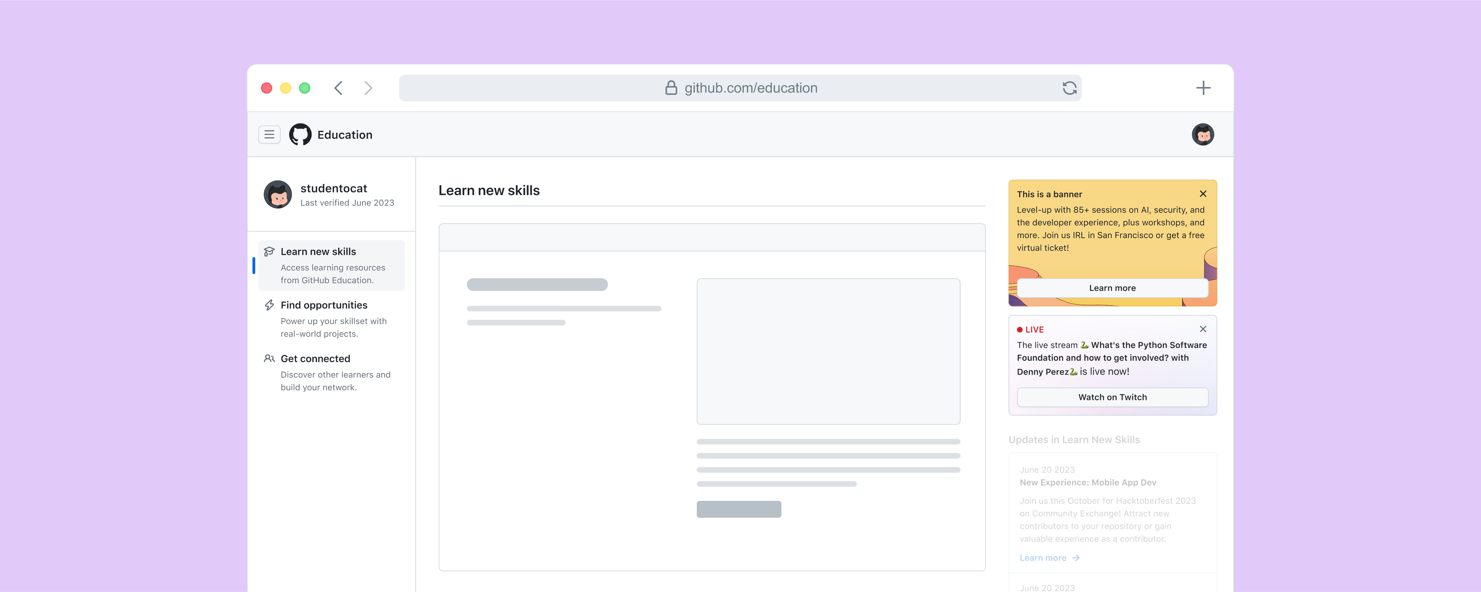
I designed a new site navigation that better matched the student learning journey around these three pillars.
Breaking free from the dashboard, I redesigned the Education web platform organized around our three pillars, reflected in a new navigation.
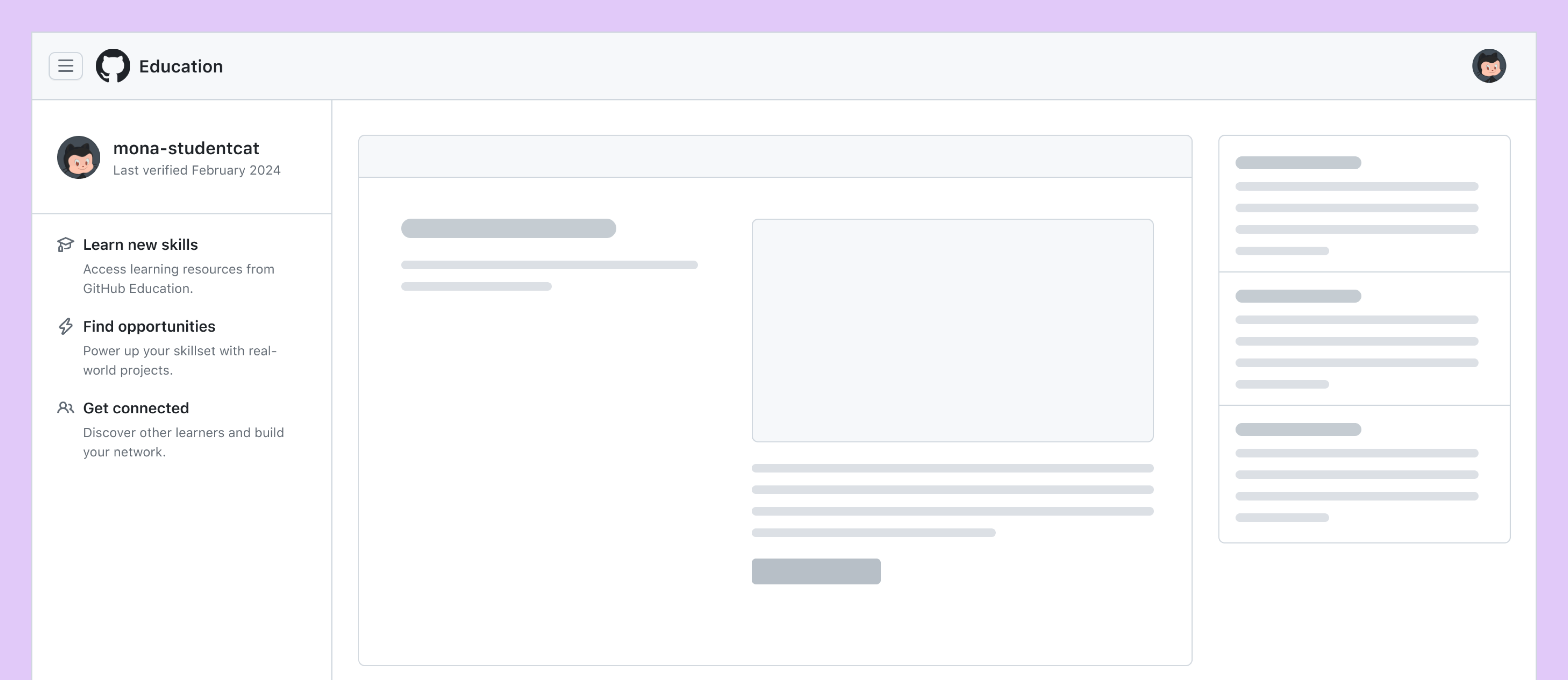
My design for a new navigation for the GitHub Education web platform.
I designed a side-navigation that explicitly organized our features into subpages around the three pillars. This way, users know immediately which page to go to depending on their learning goal, without having to sift through branded jargon or unrelated features.
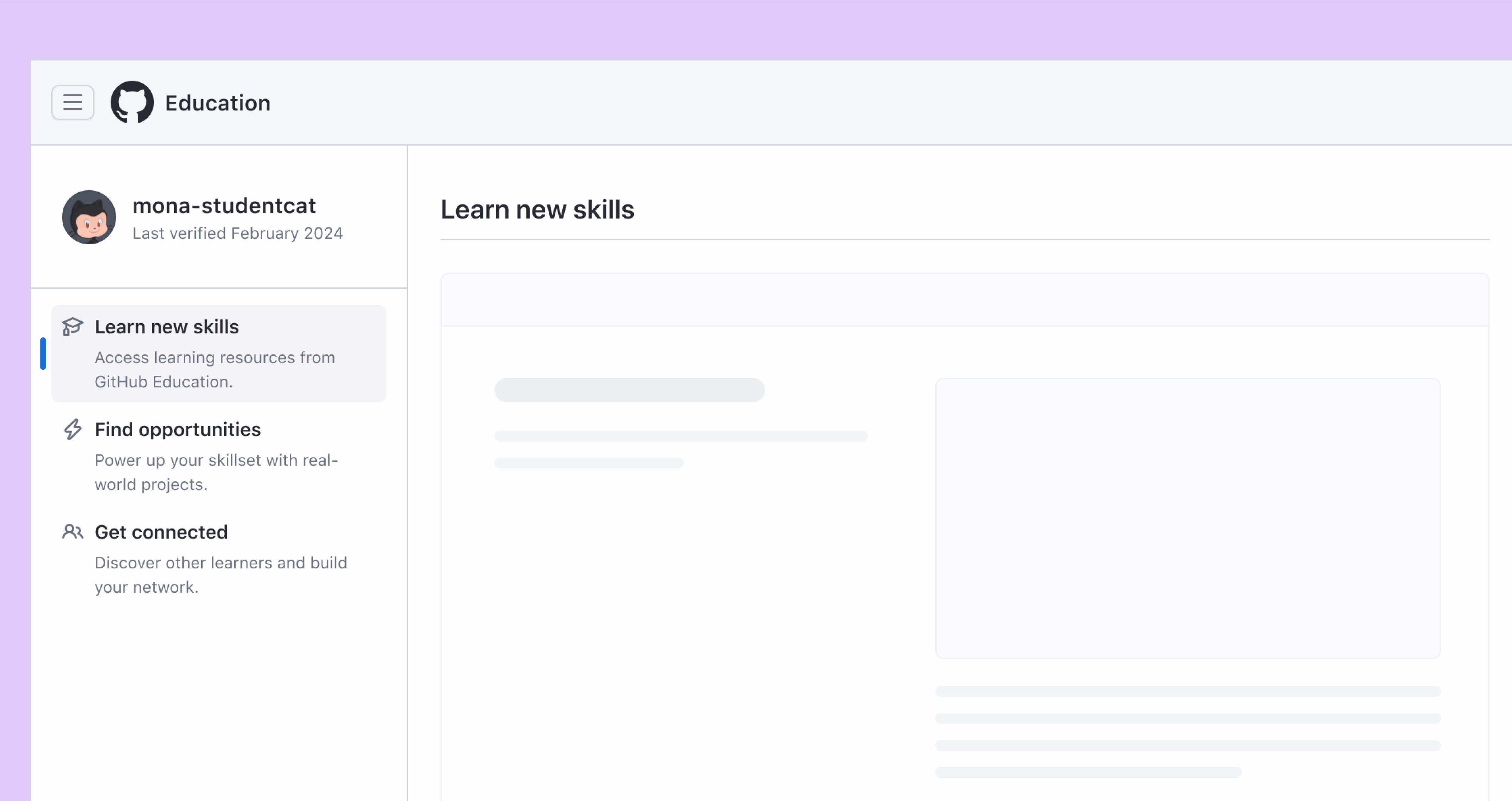
The side navigation in my design, organized by pillar. In this case, the "Learn new skills" pillar is active, meaning the user is on the "Learn new skills" page.
However, this design added an extra page load for those advanced users who knew exactly which feature they wanted to access. I designed a header navigation with a slide-out panel of specific links for our expert, feature-driven users, so that they wouldn't have to wait for an extra page load to reach their desired destination.
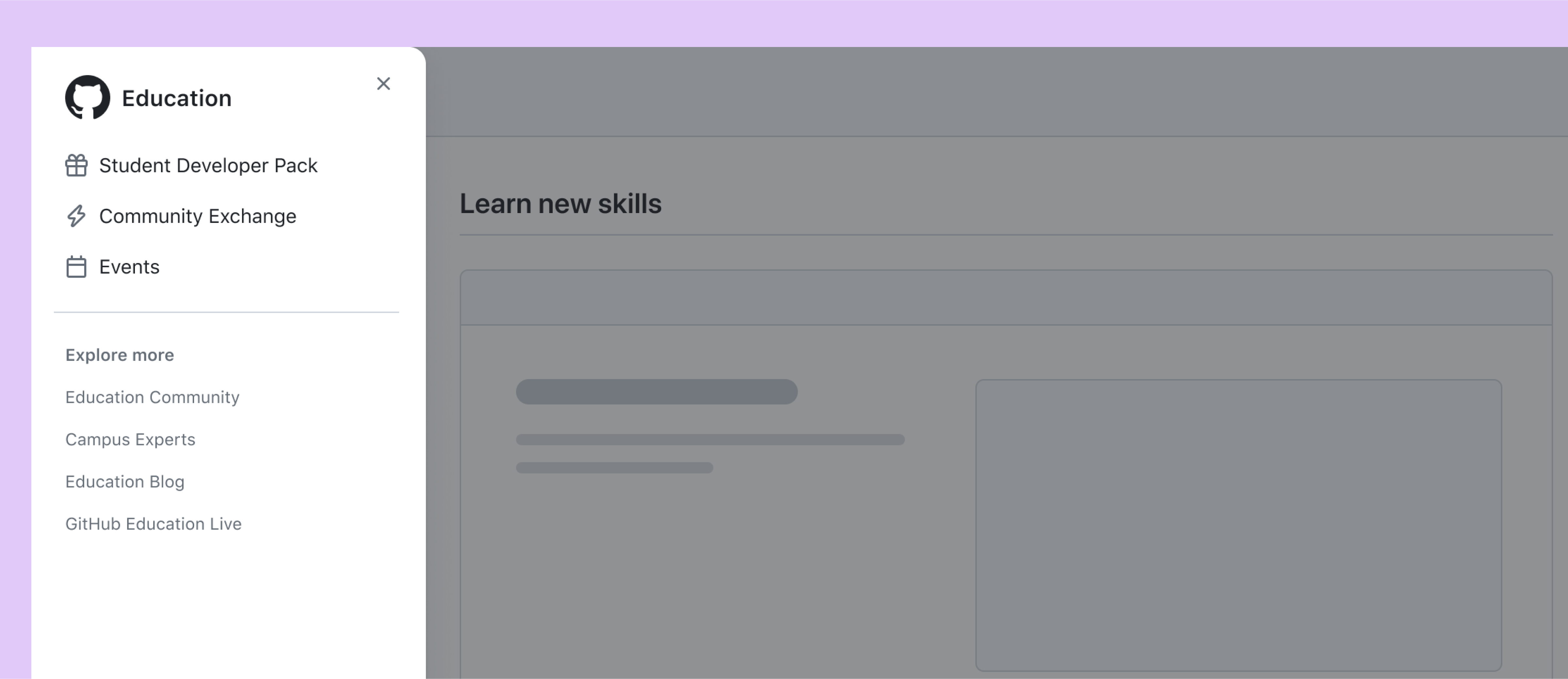
The side panel in my design, activated by the hamburger icon in the header nav, with links to specific features to reduce number of page loads for expert users.
The new navigation for the Education site shipped with positive reception from users and internal stakeholders alike.
My redesign generated buzz throughout the GitHub Education community. It marked a significant next step for the GitHub Education platform, helping our users better navigate their learning journeys.
-
"The redesign promotes user-friendliness, accessibility, and intuitive navigation, to provide Learners with the ability to find the resources they need to pursue a career in tech."
-
"Pretty impressive redesign [...] overall the design is very smooth and eye catchy. I love it."